Standard RAL colour for each use case for you projects in utah
TLDR:
- A standard ral colour is the best way to choose powder coating colors with less guesswork and better consistency across custom metal projects.
- The right RAL color depends on the use case. Staircases, railings, gates, commercial décor, and outdoor metal do not all want the same finish family.
- Dark architectural neutrals like RAL 9005, RAL 7016, and RAL 7021 usually work best for modern staircases and high-visibility fabricated metal.
- Mid-tone grays and warm dark neutrals are often easier to live with outdoors because they hide dust, hand contact, and weathering better than bright whites or very glossy finishes.
- The best color choice is never just the color code. It also includes sheen, texture, lighting, surrounding materials, and how the metal will actually be used.
- A Park City spiral staircase project we did of recent shows how the right RAL selection and powder coating process can turn strong fabrication into a true design centerpiece.
Standard RAL Colour Guide for Utah Projects: Which RAL Colours Work Best for Each Use Case
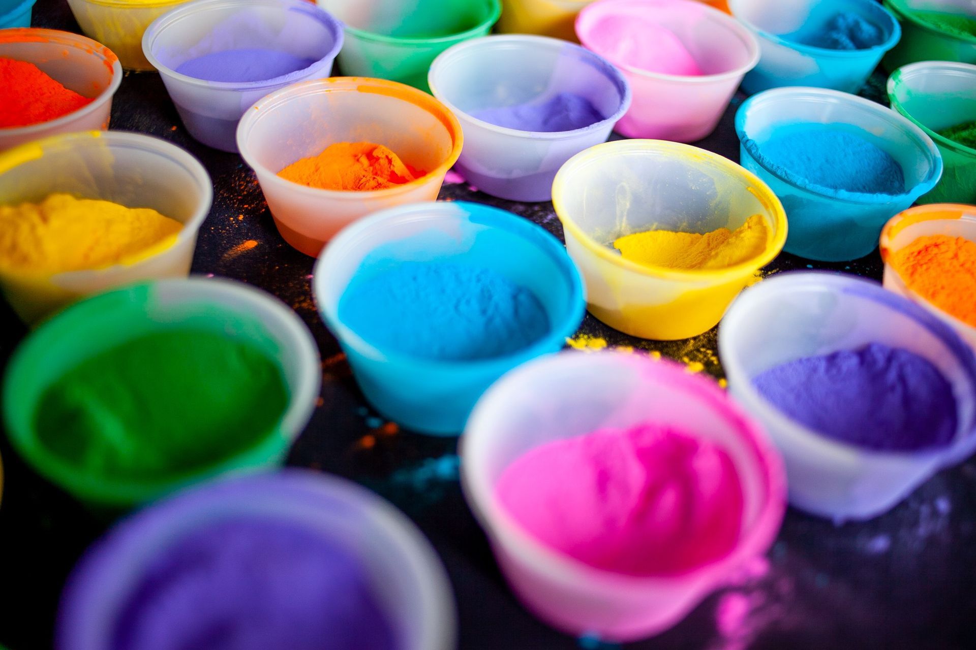
When you choose a standard ral colour for a powder coating project, you are not just picking a number off a chart. You are deciding how the project will feel, how it will age, how much maintenance it will show, and how well it will fit the space around it. That matters whether you are coating a staircase, a gate, a set of railings, a custom fabricated table base, or a large commercial metal feature. Full Blown Coatings already treats color as part of the finish system, not just decoration, and its RAL Colors, How Powder Coating Works, Media Blasting, Railings, and Custom Powder Coating pages all point in that same direction if you need some more guidance outside of our article.
A practical quote from Full Blown’s color page sums the topic up well: “The endless combinations of color, texture, and finish can be utilized in tandem to meet many goals.” That is exactly the right mindset for RAL selection, because the best color choice is never just about what looks good on a swatch. It is about what works on the actual part.
Why a Standard RAL Colour Matters More Than a Generic Color Name
If you tell a fabricator, designer, and coating shop that you want “black,” you can still end up with three very different ideas of what that means. One person may picture a deep jet black. Another may picture a softer charcoal-black. Another may assume a satin textured industrial black. That is where a standard RAL color system helps.
RAL gives everyone the same reference point. It makes it easier to:
- match finishes across parts
- keep future additions consistent
- coordinate with architects, builders, and fabricators
- choose with more confidence when the project is highly visible
That consistency matters even more in powder coating because metalwork often becomes part of the architecture itself. A staircase, railing, or gate is not like a throw pillow you can swap later. Once it is coated and installed, that color becomes part of the project for a long time.
The Right Way to Choose a RAL Color
Start with the use case
A staircase does not behave like a fence. A gate does not behave like indoor furniture. A commercial partition does not behave like a truck part. If the piece will be indoors, highly visible, and touched often, your priorities are different than if it is going outside in dust, weather, and full sun.
Then think about finish, not just code
This is where many projects go sideways. The color code is only part of the answer. The same family can look very different depending on whether it is:
- matte
- satin
- gloss
- smooth
- textured
That is one reason Full Blown’s RAL Colors page is a better starting point than a simple color list. The company frames powder coating as a combination of color, texture, and finish working together, not three separate decisions.
Finally, think about the materials around it
A black staircase next to white drywall and pale oak flooring reads differently than that same staircase next to dark stone and warm walnut. A gray gate against a stucco home reads differently than it would against a clean modern glass façade. The metal never lives alone. The space around it changes how the color feels.
The Most Useful Standard RAL Colours by Project Type
A few RAL families come up repeatedly because they work in the real world.
For modern staircases and premium architectural metal
For staircases, interior railings, and structural focal pieces, darker architectural neutrals usually win. The most reliable choices tend to be:
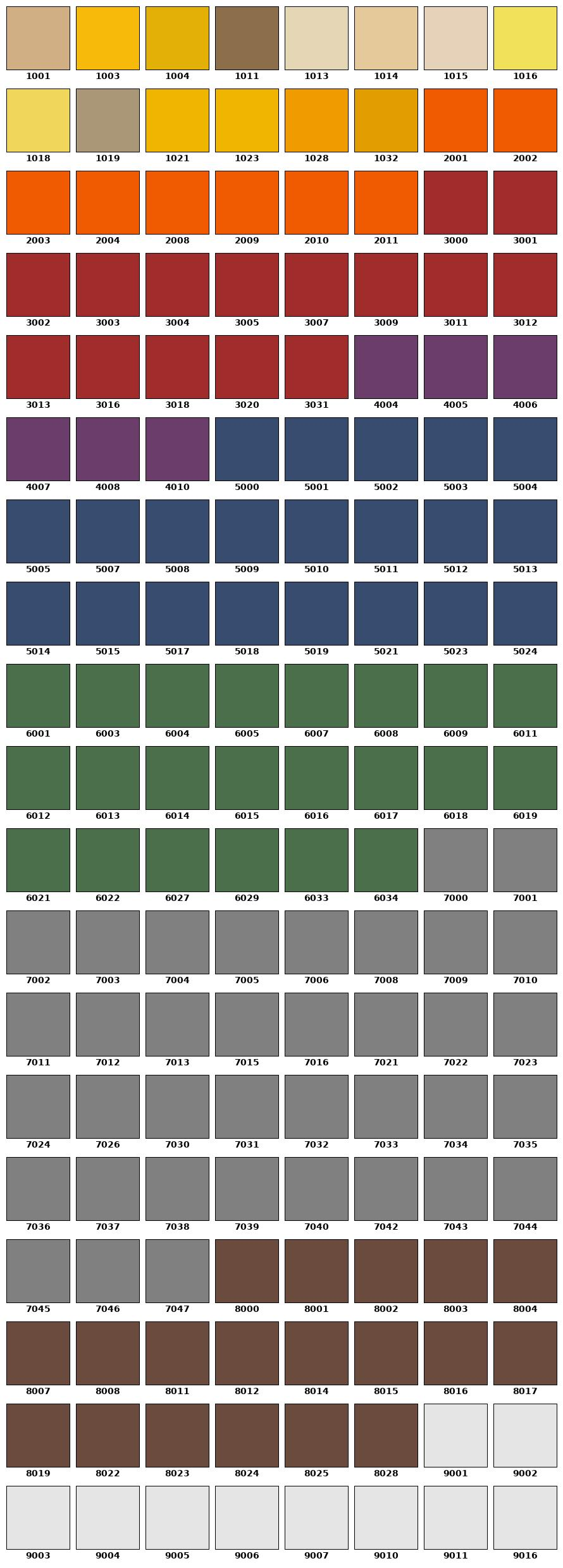
- RAL 9005 Jet Black
- RAL 7016 Anthracite Grey
- RAL 7021 Black Grey
RAL 9005 Jet Black usually works when the goal is a stronger, more dramatic architectural statement. It feels cleaner, sharper, and more formal.
RAL 7016 Anthracite Grey is often one of the best all-around modern choices because it gives you depth and contrast without feeling as absolute as a true black. It usually reads slightly softer and more architectural.
RAL 7021 Black Grey sits in a useful middle space where you still get a dark, grounded look but with a little more warmth and subtlety than a hard jet black.
For a lot of interior projects, these are the three colors that do the most work.
For exterior railings, gates, and fencing
Outdoor metal usually benefits from colors that hide dust, hand contact, and natural wear a little better. That often points back to:
- RAL 7016 Anthracite Grey
- RAL 7021 Black Grey
- RAL 8019 Grey Brown
RAL 7016 is especially useful because it feels modern without being severe. RAL 8019 can be a strong choice on homes with warmer materials like wood, stone, or darker earth-tone finishes. It is a darker neutral, but it feels more natural and less stark.
For bright modern interiors and contrast-heavy designs
If the project calls for a lighter finish, the most useful standards are often:
- RAL 9016 Traffic White
- RAL 9003 Signal White
These can look incredible on modern partitions, interior accents, and design-forward metalwork. The tradeoff is maintenance. White and light colors tend to show more dirt and contact points, especially on high-touch metal.
For accent work and custom features
Color-heavy architectural accents and custom metal décor can benefit from stronger tones like:
- RAL 5013 Cobalt Blue
- other blues or statement colors in smaller doses
The key with accent colors is proportion. On a large structural piece, they can overpower the room. On a smaller feature, they can be exactly what the project needs.
A Park City Spiral Staircase Project That Shows Why Color Selection Matters
A good way to see how all of this plays out is through a realistic custom project scenario.
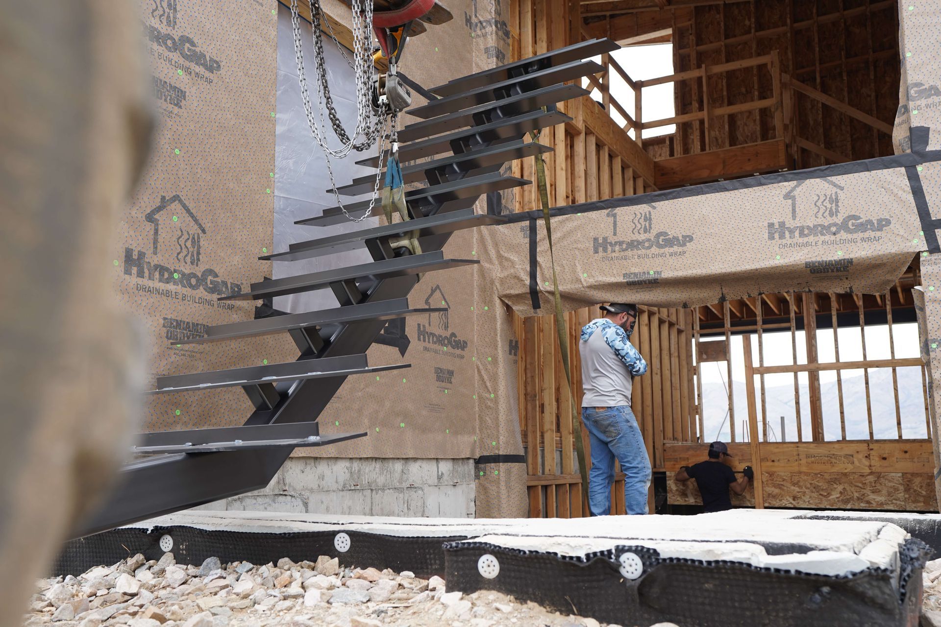
A fabricator brought Full Blown Coatings a two-story spiral staircase for a modern home in Park City. The fabrication was already strong. The curves were clean, the structure was elegant, and the staircase was clearly meant to be one of the standout features of the house. But at that stage it was still fabrication. It had not yet become architecture.
The question was not simply what color looked nice. The question was what color would make the staircase feel finished, expensive, and fully integrated into the home.
At first, the obvious answer looked like “black.” But that still left a lot open. Should it be a true deep black? A softer architectural charcoal? A textured finish? A matte finish? A satin finish?
That is where choosing a standard RAL colour actually became useful instead of theoretical.
The final direction was a matte RAL 9005 Jet Black style finish because the home had light surrounding materials and needed a staircase that would feel crisp, grounded, and unmistakably modern. The fabricator had built a strong form. The finish needed to sharpen it, not soften it.
How the Process Supported the Color
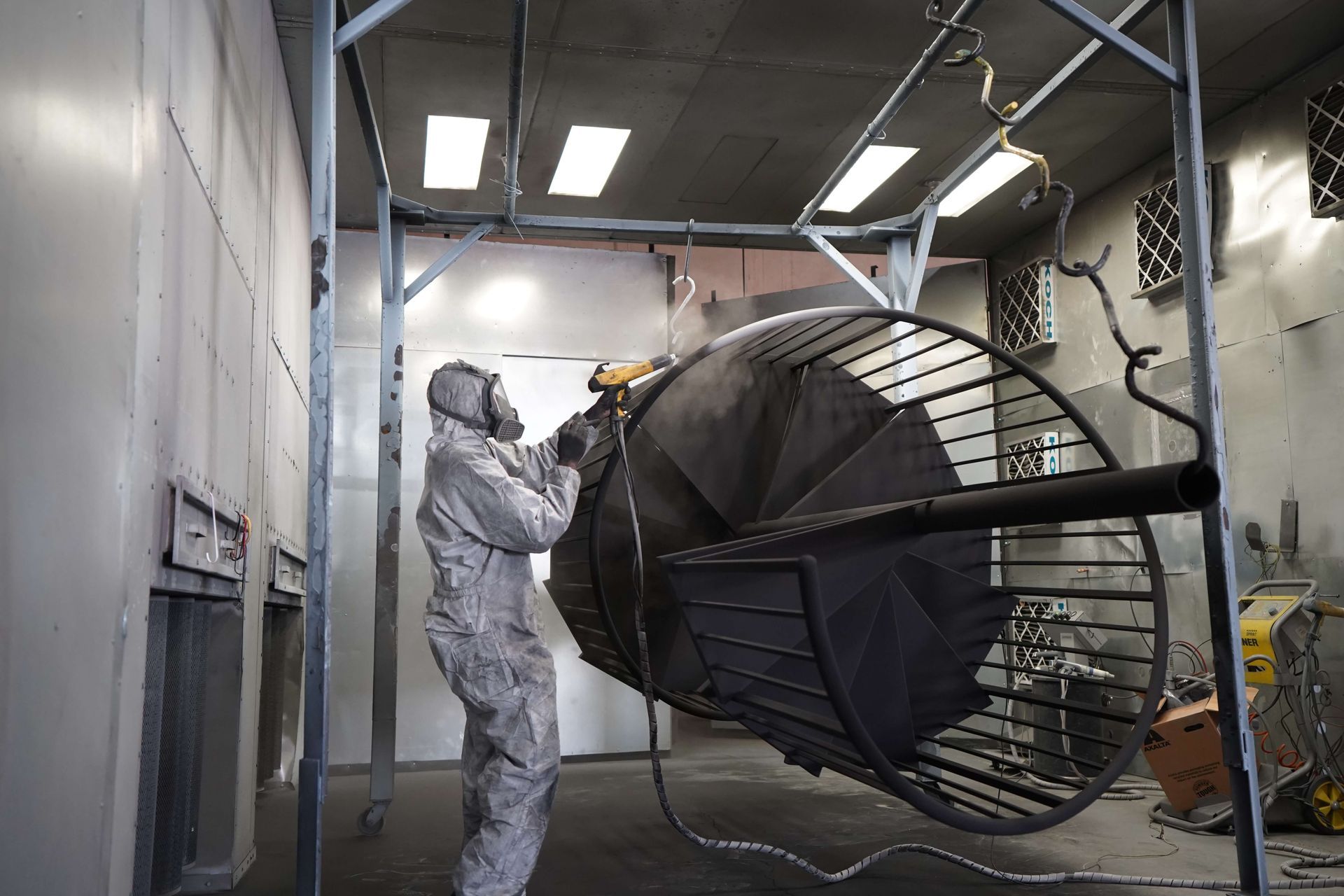
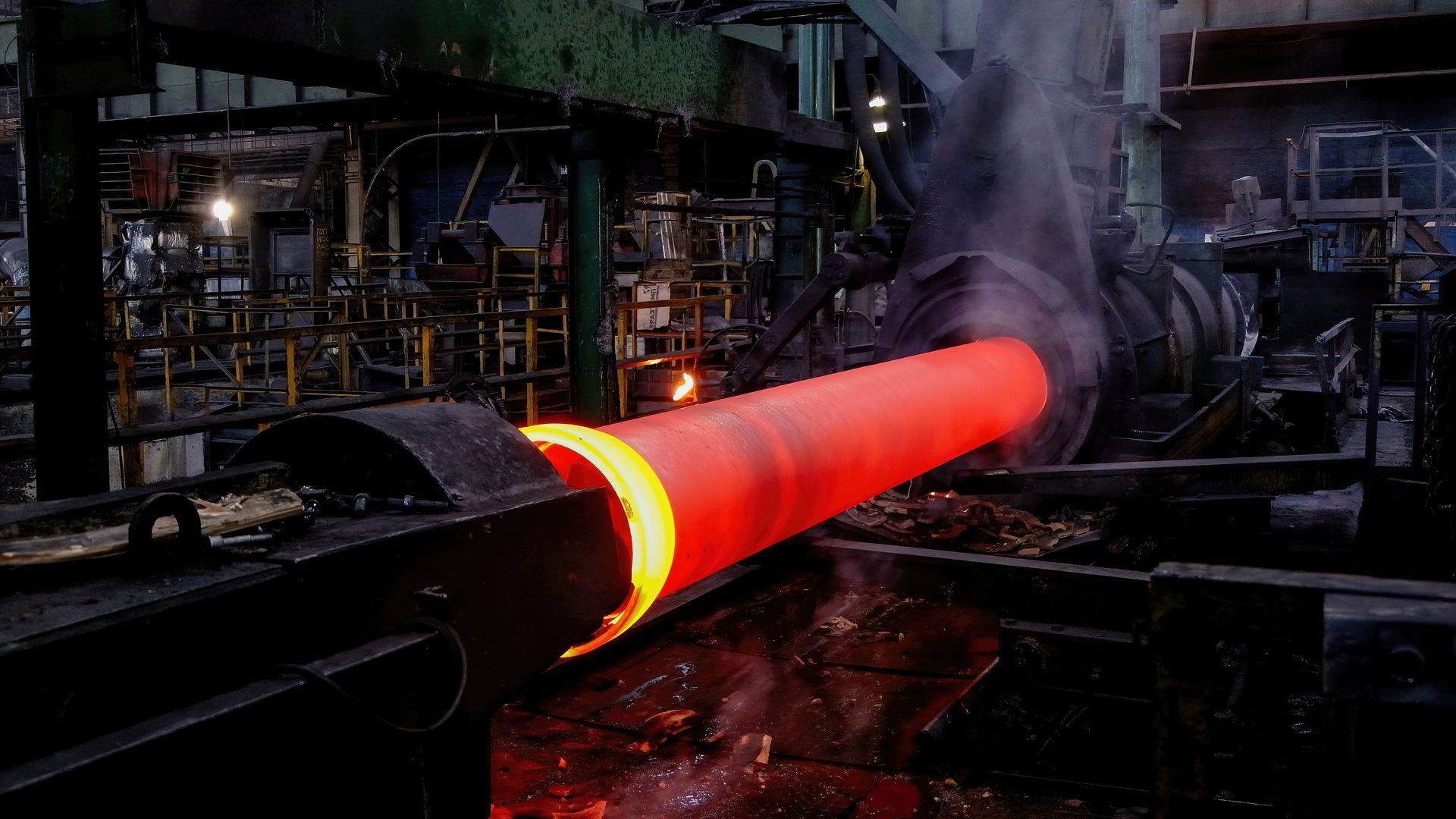
The staircase did not go straight from fabrication to color. It moved through the steps that actually make a RAL finish look right.
Fabrication review and surface prep
Because the staircase was highly visible, every seam, weld transition, and handling mark mattered. Matte black does not forgive surface inconsistency very well. That meant prep had to be treated as part of the finish, not just part of the cleanup.
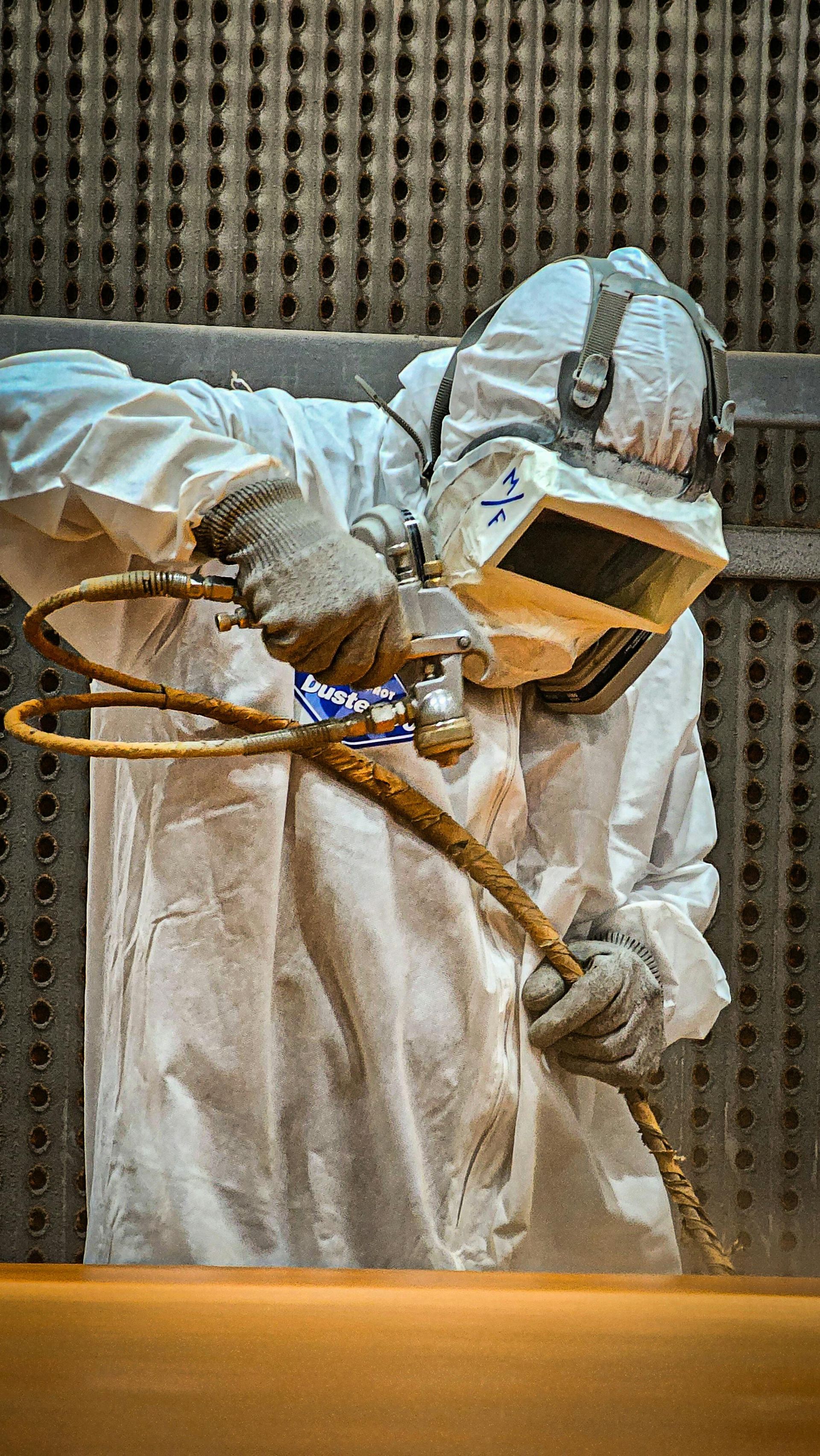
Media blasting
The staircase then moved through the kind of surface preparation that gives powder coating a real chance to perform. This is where Full Blown’s Media Blasting process and broader service structure matter. A staircase like this needs a consistent coating-ready surface, not a rushed pass that only looks clean from a distance.
Powder application
With a color like RAL 9005 in a matte architectural style finish, application consistency matters everywhere. Broad visible sections, curves, inner turns, and transitions all have to feel like one controlled finish. This is where a shop’s experience with Custom Powder Coating and architectural pieces really matters.
Cure and final handling
After application, the staircase moved through cure so the final film could fully develop. Once cured, the staircase no longer looked like raw fabricated steel waiting for a design decision. It looked like a finished centerpiece ready for installation.
Why the Installed Staircase Worked So Well
Once installed, the staircase did exactly what the color needed it to do. It did not just blend in. It gave the home structure and contrast. The matte RAL 9005 finish gave the piece weight, clarity, and a premium architectural feel. It turned the staircase into one of the strongest visual features in the house.
This is where a lot of people underestimate color selection. The fabrication can be excellent, but if the finish feels generic or slightly off, the whole piece loses impact. The right RAL color does not just color the metal. It changes how the project is perceived.
The Best RAL Colors for Common Use Cases
If the project is a spiral staircase or interior architectural feature, start with:
- RAL 9005
- RAL 7016
- RAL 7021
If the project is an outdoor railing, gate, or fence, start with:
- RAL 7016
- RAL 7021
- RAL 8019
If the project is a bright modern interior accent, start with:
- RAL 9016
- RAL 9003
If the project is a statement accent piece, consider:
- RAL 5013 or another stronger accent color, but use it intentionally.
These are not the only options. They are simply the families that tend to work repeatedly because they solve common problems well.
Common Mistakes to Avoid
A few mistakes show up over and over again in color selection:
Choosing from a screen only
One of the most practical rules in the RAL system is that on-screen samples are not binding and final color decisions should be confirmed from real samples or official references, not just a monitor view.
Treating all blacks or grays the same
A project can feel too harsh, too flat, or too soft if the wrong dark neutral is chosen.
Ignoring texture and sheen
A smooth satin RAL 7016 and a textured matte RAL 7016 do not feel the same in person, even though the code family matches.
Choosing color before talking through use
A good coating shop should help match the RAL family to the project type, not just accept a number and move on.
Final Thoughts
A standard ral colour is useful because it gives you a better way to make coating decisions with less guesswork. But the code is only the starting point. The real decision is how that color works with the project, the finish texture, the lighting, the surrounding materials, and the way the metal will actually be used.
That is why the Park City staircase worked so well. It was not successful because black is always the answer. It was successful because the fabrication, prep, powder coating process, and color selection all worked together.
If a project like that is on the horizon, it helps to start with the right internal resources:
- compare options on the RAL Colors page
- understand the process on How Powder Coating Works
- review the prep side on Media Blasting
- and look at how similar architectural work fits services like Railings and Custom Powder Coating.
That is usually where the best color decisions start: not with a random chart, but with the kind of project you actually want to build.
Share This Post!